Pixel art is the most approachable art style in game development, and the easiest one to get subtly wrong. Pixel art for games is not simply "low resolution" — it is a craft with its own rules about canvas size, palettes, readability and animation, and almost all of those rules exist for one reason: at this scale, every single pixel has to earn its place.
This guide takes you from a blank canvas to a sprite that is actually running in a game. You will pick a resolution, build a limited palette, draw a clean character, animate a walk cycle, and import the result into an engine without it turning into a blurry mess.
What counts as pixel art?
Pixel art is art where you place pixels deliberately, one at a time, at a low resolution. That is the whole definition. It is not a filter, and it is not a photo shrunk down.
The style grew out of hardware limits. Consoles of the 1980s and 1990s could only display a small grid of pixels and a handful of colours at once, so artists learned to suggest detail instead of drawing it. Those constraints turned out to produce a look people love, so developers keep choosing them on hardware that could render anything.
Two practical consequences follow from the definition:
You work small and zoom in. A 32×32 character is drawn at 32×32 and displayed scaled up, never drawn large and shrunk.
Scaling must be by whole numbers. 2×, 3×, 4×. A 2.5× scale duplicates some pixel rows and not others, and the sprite develops a visible wobble.
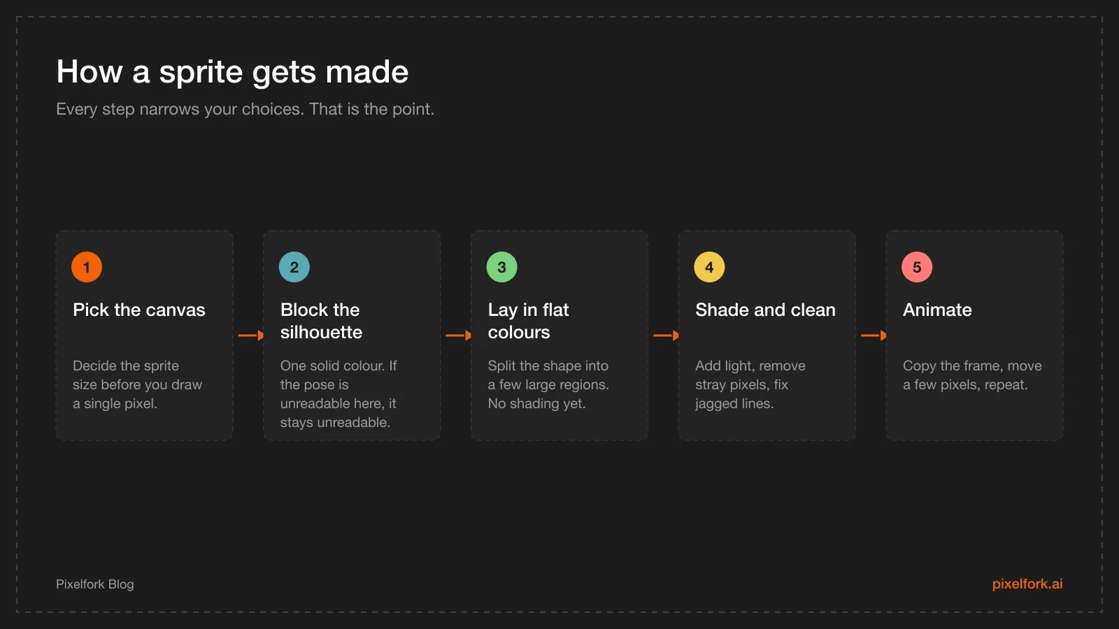
The same five steps apply whether you are drawing a rock or a boss.
Why pixel art for games is still the right first choice
There are practical reasons beyond nostalgia to start here.
It is fast to iterate. A 16×16 enemy takes an hour, not a week. You can redraw it three times while you work out what the game actually needs.
It hides your weaknesses. Anatomy, perspective and brushwork all get forgiving at low resolution. A 24-pixel-tall character does not need correct hands.
It is cheap to animate. A four-frame walk cycle at 32×32 is a realistic evening's work. The same animation in a detailed 2D style is a week.
It scales down well. Small sprites and tight palettes keep texture memory low, which matters on phones. Our guide to mobile game performance goes deeper on why that helps.
The real cost is precision. There is nowhere to hide a sloppy line when the line is four pixels long.
Step 1: Pick a canvas size and commit
This is the decision people skip, and it is the one that causes the most rework. Your canvas size defines your entire art style, because it decides how much detail is possible everywhere else.
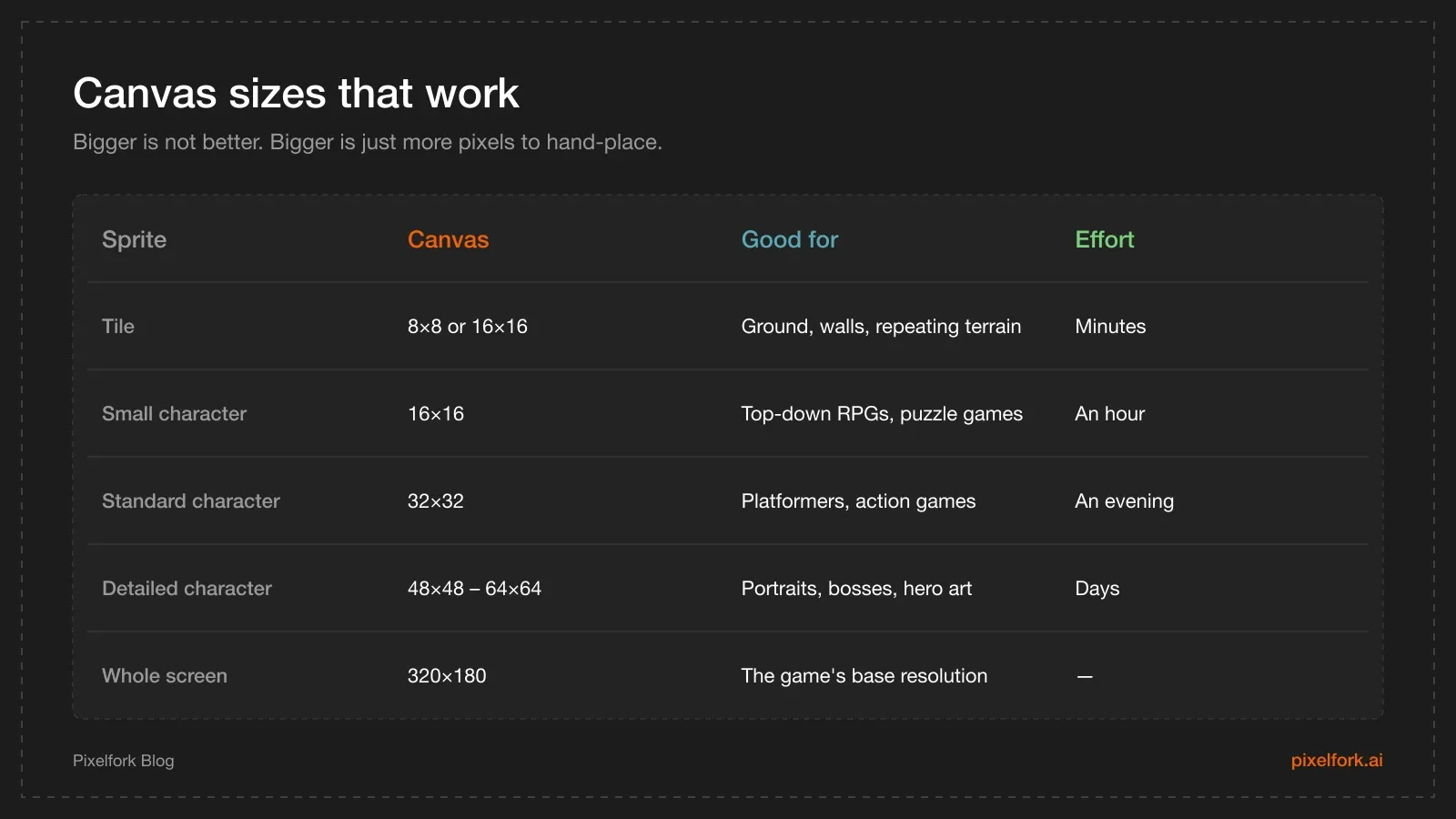
Pick one row and build the whole game around it.
Two rules make this easier:
Pick a base resolution for the game first. 320×180 is a common choice because it multiplies cleanly into 1280×720, 1920×1080 and 2560×1440. Everything else — sprites, tiles, UI — is sized to fit inside that screen.
Pick a tile size and never change it. 16×16 is the safe default. Every piece of terrain, every platform and every door snaps to that grid, which keeps levels easy to build and easy to edit later.
If a character is 32 pixels tall on a 320×180 screen, roughly five and a half characters stack vertically on screen. That is a useful sanity check before you commit.
Step 2: Build a limited palette
Beginners reach for the colour picker every time they need a new shade. Experienced pixel artists pick a small set of colours once and reuse it across the entire game.
A workable starting palette:
2–4 colours per material. A base tone, a shadow, a highlight, and sometimes a dark outline.
8–16 colours total for a sprite. Fewer than you expect. Most classic sprites use far fewer.
32–48 colours for the whole game. Shared across characters, tiles and effects.
Two techniques do most of the work:
Hue shifting. Do not make a shadow by dragging the brightness slider down — the result looks muddy and grey. Shift the hue as well: shadows go cooler (toward blue or purple), highlights go warmer (toward yellow or orange). This single habit is the biggest visual upgrade available to a beginner.
Ramps. A ramp is an ordered strip of 3–5 colours going from the darkest shadow to the brightest highlight of one material. Build a ramp for skin, one for metal, one for foliage, and shade everything by moving along a ramp instead of inventing new colours.
Reusing a small palette also makes the game look coherent, which is half of what people mean when they call art "polished". If you are still deciding on the overall look, our 2D game art pipeline notes cover how to keep a style consistent across a whole project.
Step 3: Draw the sprite
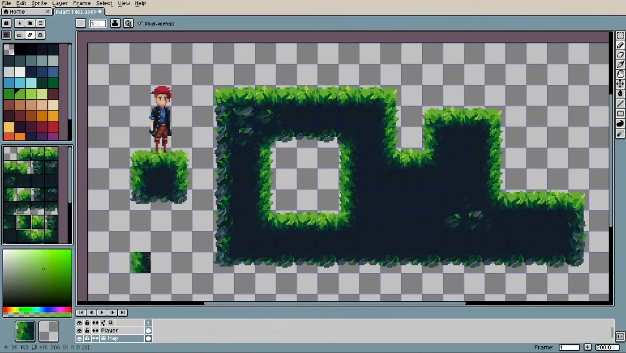
Open your editor at your chosen canvas size, turn on the pixel grid, and work in this order.
Silhouette first. Draw the whole character as a solid black shape. Squint at it. Can you tell what it is and which way it faces? If not, exaggerate — widen the shoulders, enlarge the head, angle the weapon outward. Readability at a glance beats accuracy at this size, every time.
Flat colours next. Split the silhouette into large regions: skin, shirt, trousers, boots. No shading yet. Check that the regions read clearly against each other and against your background colour.
Then shade. Pick one light direction — top-left is conventional — and stick to it across every sprite in the game. Add a shadow tone on the opposite side of each form and a highlight where light hits directly. Keep it to one or two extra tones per material.
Clean up last. Two specific fixes matter:
Remove orphan pixels. A single stray pixel that is not part of a line or a shape reads as dirt on the screen.
Fix jaggies. A diagonal line should have evenly sized steps — 2 pixels, 2 pixels, 2 pixels. A sequence like 3, 1, 2 creates a visible bump. Fixing jaggies is tedious and it is exactly what separates clean pixel art from rough pixel art.
Should you outline?
Both approaches work. A full outline (usually a dark version of the base colour, not pure black) makes sprites pop against busy backgrounds and is easier for beginners. Selective outlining — dark outline on the shadow side, none on the lit side — looks more modern and integrated, but demands more care. Pick one and apply it to everything.
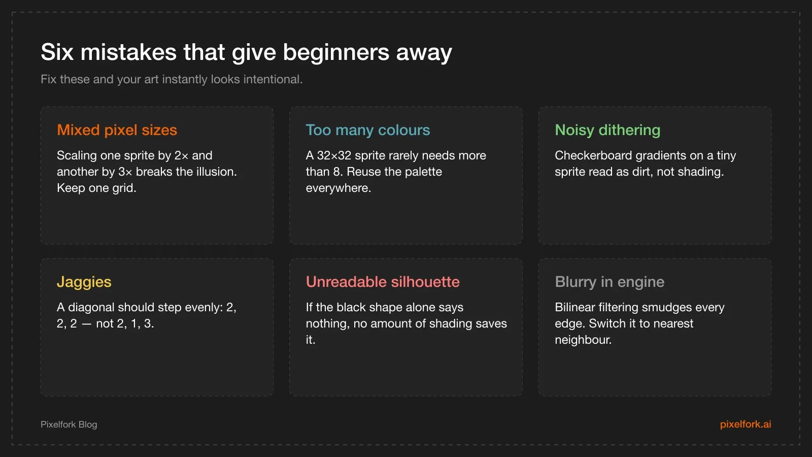
Most beginner pixel art fails on one of these six points.
Step 4: Animate it
Animation is where pixel art gets its charm, and it is more forgiving than it looks because the frame rate is low.
Idle (2–4 frames). The smallest useful animation. Move the chest up one pixel, drop it back down, and optionally shift the head. Two frames at roughly 4 frames per second already makes a character feel alive rather than pasted onto the screen.
Walk cycle (4–8 frames). Four frames is enough for most games. The classic sequence is: contact (legs apart, both feet down), down (weight lowest, body drops one pixel), passing (legs together, body highest), and the mirror of those for the other leg. Bob the whole body up and down by one pixel — that vertical bounce is what sells the weight.
Attack (3–5 frames). Anticipation (wind up backwards), the strike, and a short recovery. Hold the strike frame for a shorter time than the others; fast frames read as impact.
Two techniques to use as soon as your editor supports them:
Onion skinning shows the previous and next frames as ghosts, so you can see exactly how far each pixel moved.
Sub-pixel animation shifts a shape by one pixel at a time rather than redrawing it, which keeps volumes consistent between frames.
Once the animation loops correctly, it needs to drive an actual character. Our walkthrough of building a 2D platformer character controller covers wiring animation states to movement.
Step 5: Get it into your engine without blur
This step trips up nearly everyone, because engines default to settings designed for high-resolution photos.
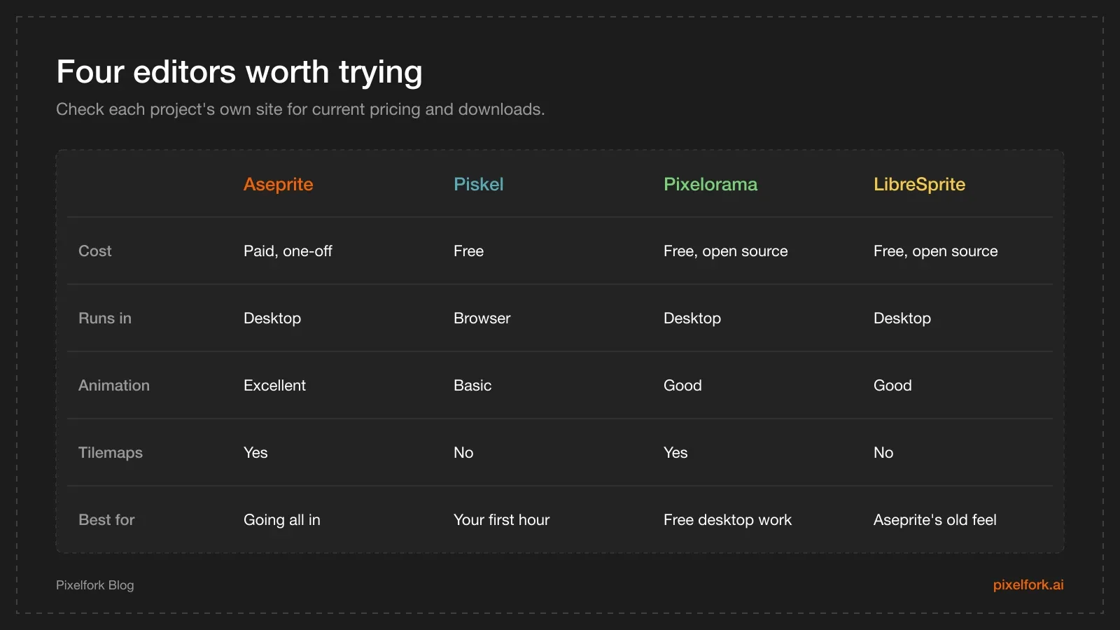
Any of these will do the job. Start with whichever you can open fastest.
Whatever engine you use, three settings need changing:
Texture filtering  →  Nearest neighbour / Point   (not bilinear or linear)
Texture compression →  None                       (compression smears small sprites)
Mipmaps            →  Off                         (they blur sprites at distance)
In Unity, that is Filter Mode: Point (no filter) and Compression: None on each sprite, plus a consistent Pixels Per Unit value — set it to your tile size, for example 16. Unity also ships a Pixel Perfect Camera component that locks the game to whole-number scaling.
In Godot, set the texture filter to Nearest in project settings, and use the viewport stretch mode with an integer scale so the game resolution multiplies cleanly to the window size.
Two more rules apply everywhere:
Never rotate pixel art by arbitrary angles at runtime. Rotating a sprite 37 degrees resamples it and destroys the pixel grid. Either draw rotated frames by hand or accept that the object will look resampled.
Keep sprite positions on whole pixels. A character at x = 10.3 renders with the same smearing as bilinear filtering. Round positions to the pixel grid, or let a pixel-perfect camera do it for you.
If you do not want to draw it yourself
Drawing is not the only route to a finished game, and for a first project it is often not the best use of your time.
Asset packs. Marketplaces such as itch.io host a large number of free and paid pixel art packs. Check the licence before shipping, and prefer one pack over a mix of five — mismatched pixel sizes and palettes are obvious.
Placeholders. Coloured rectangles are a legitimate way to build and test a whole game before any art exists. If the game is not fun as rectangles, art will not fix it.
Generate it. AI tools can produce sprites and tiles from a description, which is useful for prototyping and for filling out background elements. The results still need a cleanup pass in a pixel editor, because generated images often sit off the pixel grid or use far too many colours.
Whichever route you take, write down the target canvas size, tile size and palette somewhere the whole project can see. A game design document is the natural home for it, and it stops the art drifting halfway through.
FAQ
What is the best pixel art size for games?
16×16 for tiles and small characters, 32×32 for standard platformer characters, and 48×48 to 64×64 for detailed heroes or bosses. Choose one tile size for the whole project and size everything else against it.
What software should I use for pixel art?
Piskel runs in a browser and costs nothing, which makes it the fastest way to start. Pixelorama and LibreSprite are free desktop options. Aseprite is the paid tool most professionals use — check its official site for current pricing before buying.
How many colours should a pixel art sprite use?
Usually 8–16 for a single sprite, and 32–48 shared across an entire game. Fewer colours, reused consistently, look more deliberate than many colours used once each.
Why does my pixel art look blurry in my game?
The engine is filtering the texture. Set texture filtering to nearest neighbour or point, turn off compression and mipmaps, and scale the game by whole numbers only.
Is pixel art easier than other game art styles?
It is faster to produce and far more forgiving of weak drawing skills, but it is not effortless. The difficulty moves from drawing accurately to placing individual pixels with intent.
How long does it take to learn pixel art?
You can draw a usable 16×16 sprite on day one. Consistent, clean work across a whole game usually takes a few months of regular practice — mostly spent learning palettes and readability rather than drawing technique.
The fastest way to learn what your art actually needs is to see it moving in a real game. Sketch a sprite, drop it into a playable prototype, and let the game tell you what to fix — you can build and share that prototype in your browser on Pixelfork. If you would rather skip the engine setup entirely, our guide to making a mobile game without coding is a good next step.